Microsoft is rolling out an updated version of Outlook.com Beta, their mail and calendar service which requires a Microsoft account. This special beta version will allow enthusiasts to join the testing of the upcoming features of the service. With the recently delivered update, Outlook.com Beta has introduced tabs.
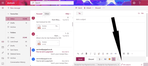
Outlook.com Beta now comes with a tabbed user interface which allows opening multiple emails in tabs.

The new option is enabled by default. Every time you click on the New Message button, it opens in a new tab. For existing letters, e.g. for received messages in your Inbox folder, the ability to open the message in a new tab is also accessible from the context menu.
The tab row appears at the bottom of the page. As of this writing, it is tiny and not easily noticeable. Traditionally, tabs are located at the top in applications like web browsers, so expect the same for Outlook.com in the future.
Besides tabs, the new Outlook.com Beta includes word suggestions and PhotoHub that allows quickly picking an image from a list of uploaded and received files.
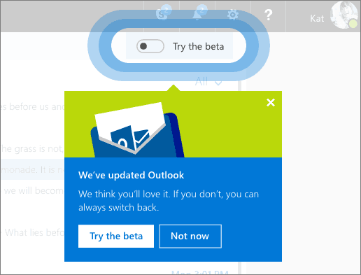
To join the beta program, use the toggle switch which appears in the top right corner of your inbox. This will enable all the new features for you, however, the service may become less stable, since it is a work-in-progress.

Image credits: MSPowerUser
Support us
Winaero greatly relies on your support. You can help the site keep bringing you interesting and useful content and software by using these options:

Is there a way to change the layout in the new outlook, as I find it difficult to read when’s its all vertical. When I last tried the beta version, this wasn’t possible. Hope they have the option to change in the final build. I really don’t know why anyone would want it laid out like that, the email list in the top half, and the email itself underneath seems to me, so much easier for viewing emails, or is it just me.
it is a sack of poo. You can no longer opean a message in a separate window by double clicking. Immersive reader is so dumb it is too idiotic to use.