Firefox 67 is the upcoming version of the popular browser. Currently it is available in the Nightly channel. It features an updated about:config page and a revamped user interface for the add-on manager. Let's see what has changed.
Advertisеment
Two new features have landed in the Nightly stream of the popular browser. The first one is a new about:config page.

The new page is built on web technologies, while the previous one was created using classic XUL technology that Mozilla is gradually deprecating.
The new page opens blank, shifting the focus to the search bar. To see the list of values, you need to click on the Show All button.
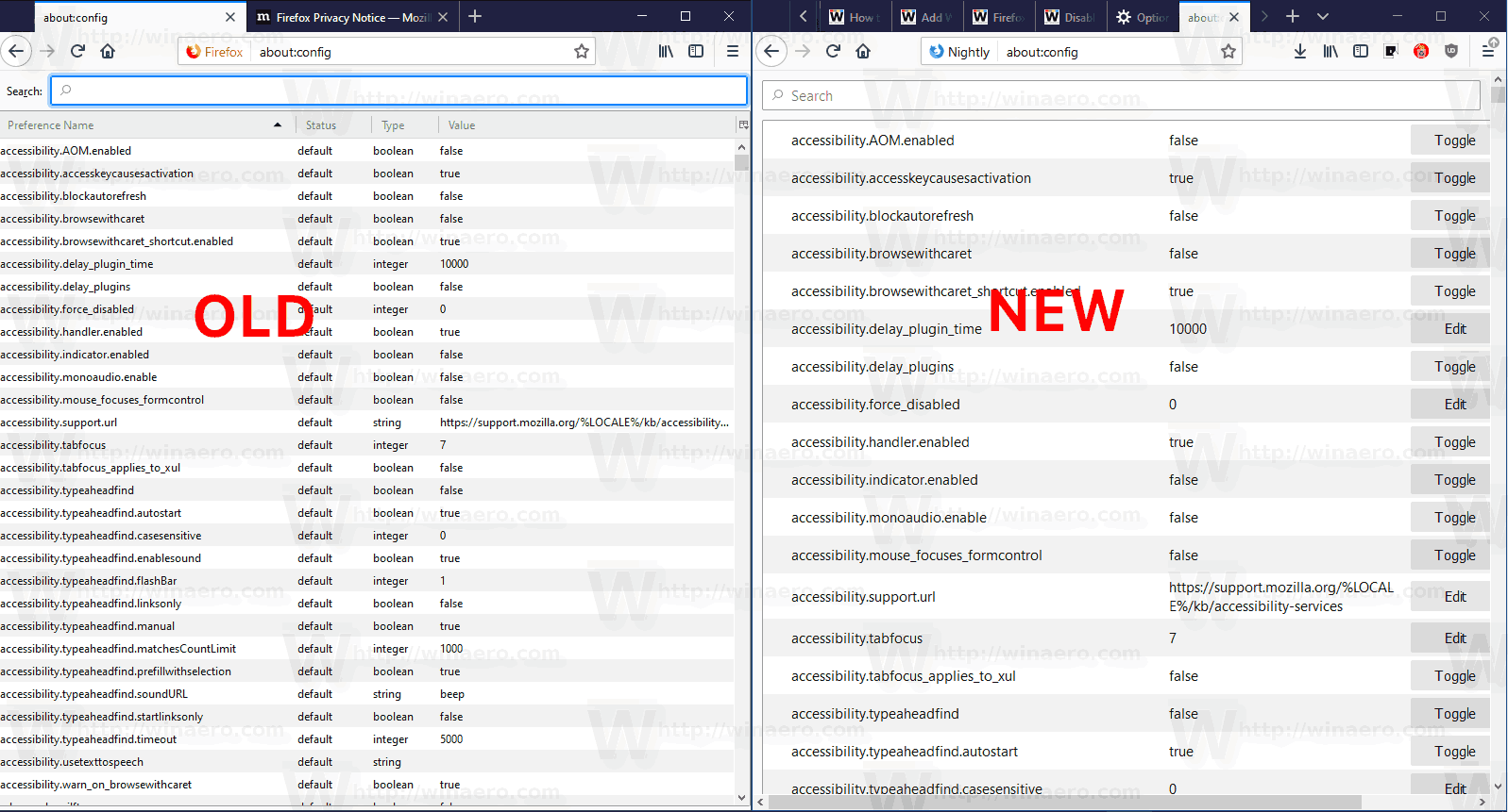
The rows on the new page are taller, making it less compact and touch friendly.
The behavior of the page has also changed. As you may remember, the classic configuration page required a double-click to modify values. This is no longer possible; you should use Toggle/Reset buttons next to the value data column to change a parameter.

According to developers, the new page delivers the following improvements:
* There are visible buttons for editing preferences
* String values are displayed in full as multi-line text
* Find in page works for both names and values
* Triple click selects a preference name or value quickly
* Text selection works on multiple preferences
* The context menu is the same as regular web pages
- Copy to the clipboard
- Open selected link
- Search with your preferred engine
* Search results don't include spurious value matches anymore
* Closing and reopening the browser while the tab is pinned
preserves the search term
The new page is a work in progress. Currently, it lacks some features of the classic page, e.g. it doesn't allow sorting the list of parameters. We can expect more changes made to the new about:config page before it reaches the stable branch of the browser.
Add-ons Manager Changes
Besides about:config, Firefox 67 is getting a new Add-on manager feature. It has also been rewritten from XUL to HTML. At the time of this writing, a preview version of the new user interface is already available in the Nightly version of the browser. However, it is disabled by default and needs to be enabled manually via a special about:config option, extensions.htmlaboutaddons.enable, that needs to be set to true.

The current UI doesn't look much different from its predecessor.
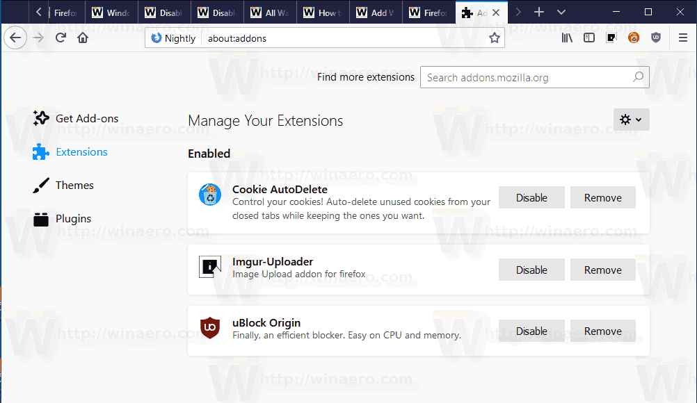
The following screenshots demonstrate what Mozilla is working on. At the end of development, we should get something like this.
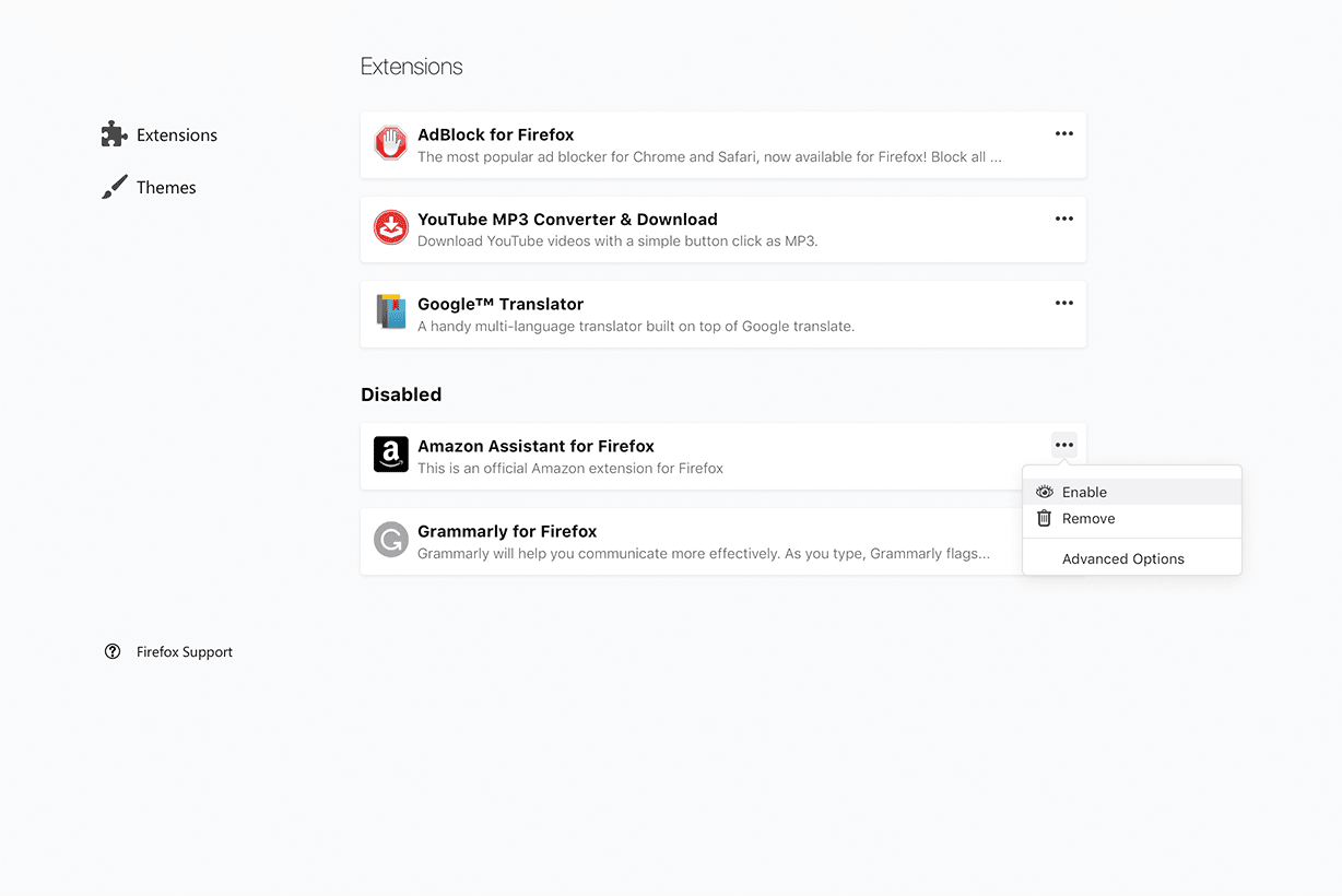
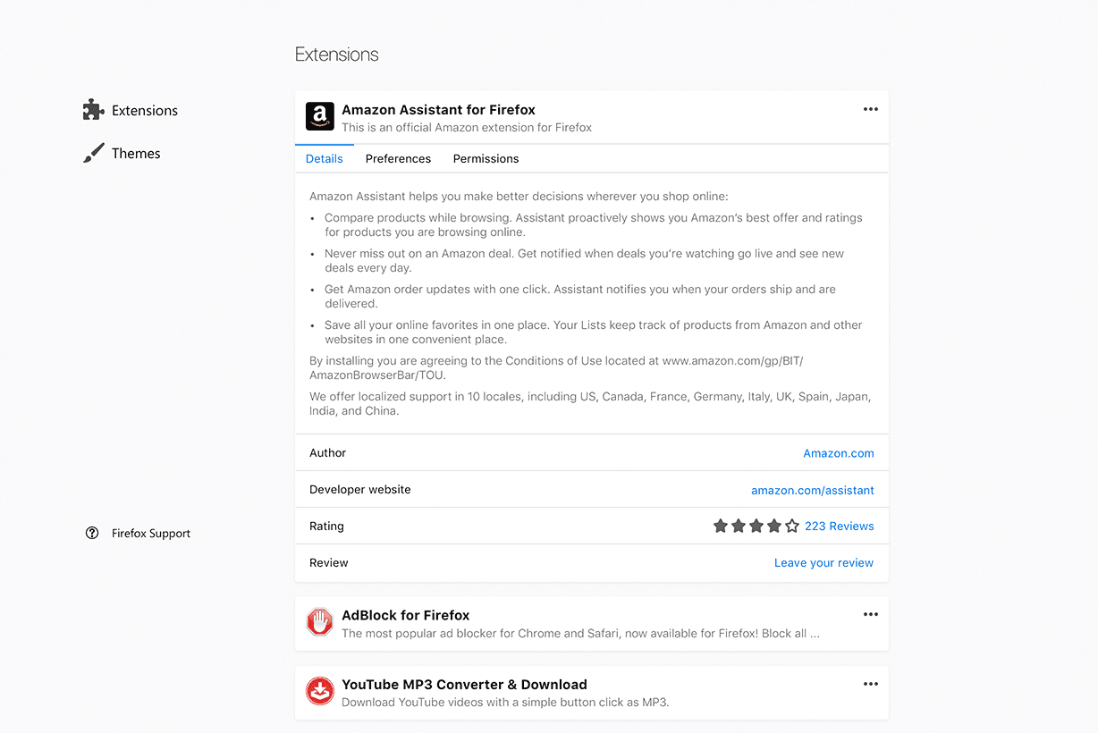
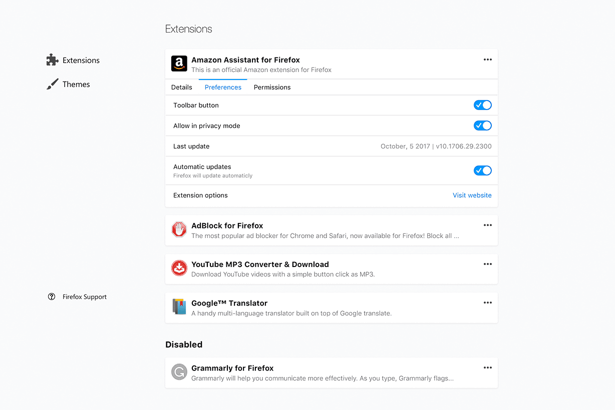
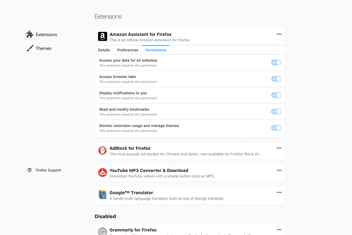
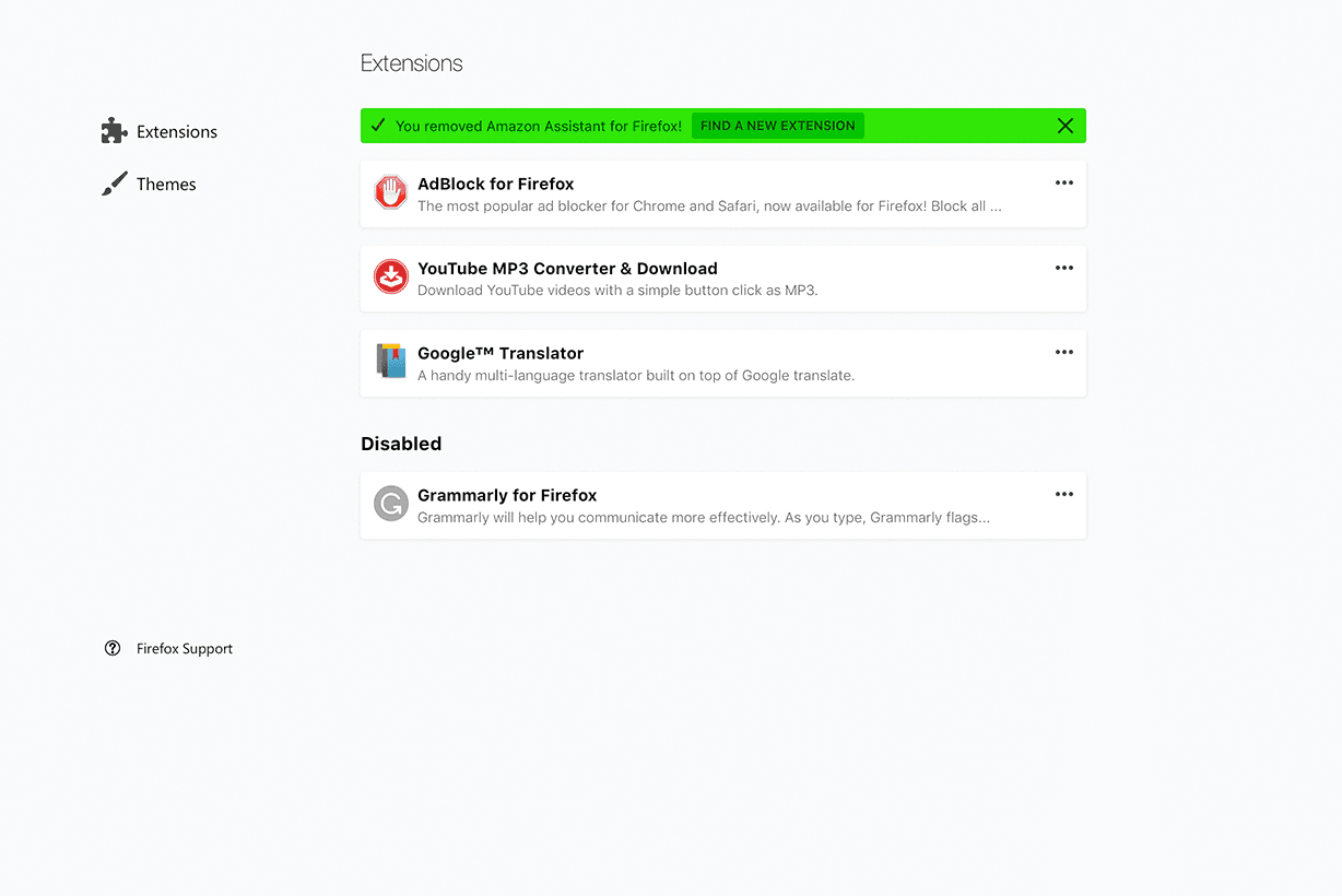
To get the page looking more compact, its action buttons will be moved to a menu. Clicking on the Advanced options menu item opens a new page with three tabs, Details, Preferences, and Permissions. Those three tabs contain all the information about the add-on along with its general settings. At a glance, it is not clear how it is supposed to open the add-on's individual options. Also, it is worth mentioning that disabled add-ons are displayed in a dedicated section.
Image credits: Sören Hentzschel
Support us
Winaero greatly relies on your support. You can help the site keep bringing you interesting and useful content and software by using these options:

I *really* wish applications were more intelligent about spacing GUI elements out to make them “touch friendly” — as a 100% desktop user it’s just a waste of good screen space for me. Hopefully there will be a css hack to fix it.