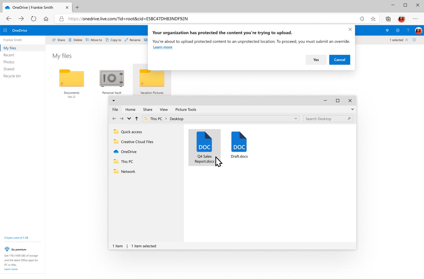
As you may remember, in addition to the File Explorer app Windows 10 includes a new UWP File Explorer counterpart. In a post on the Windows Experience blog, Microsoft included a new screenshot of the app, that features a bit updated design of the app.
The new File Explorer app bundled with Windows 10 starting with the "Redstone 2" update. It is hidden and has no shortcut yet. It is a modern File Explorer, a Universal app which could replace the classic File Explorer in the near future.
Windows 10 ships with mostly the same version of Explorer as Windows 8 except for a few changes like Quick Access replacing Favorites. However, Microsoft is making a new "File Explorer" app, which will be a Universal app like Photos, Cortana or Settings.
As of this writing, it is a touch oriented app that allows performing all the basic file tasks which are currently available in File Explorer. These include operations like move, delete, share, select and copy items, set their properties. It also includes the ability to switch to various views for files and folders the way the classic File Explorer app allows in Windows 10.

The new screenshot reveals a tab strip that reminds of the Ribbon UI. It includes File, Home, Share, and View. Interestingly, that the app window has no title now. Other notable change is the appearance of the sidebar, that now uses Microsoft's latest icons.
It is still not known when Microsoft will officially introduce this app and for which devices. To check out the current version of the app, run it as follows:
How to launch the Universal File Explorer app in Windows 10
Support us
Winaero greatly relies on your support. You can help the site keep bringing you interesting and useful content and software by using these options:

That looks terrible. Please god no! Please no!!
Jerry, I was already alarmed when this site reported on the new folder icon in the start menu. They would only create a new icon there if they want to replace it in file explorer, or change the application.
I have feared for a long time that they want to retire file explorer (like the control panel and search) in favor of a feature-regressive UWP app. Make no mistake – all these explorer tweaks this site features and all shell extesions won’t work in the UWP app.
If it’s just an optional addition or something for Win10X then I won’t complain.
That new folder icon is literally the same 1903+ File Explorer icon, without the blue holder thingy.
Now, other than the awful doc icons, it doesn’t look too different from the current one. It may not even be UWP. The quick access icons are missing, but that downwards arrow may allow you to add them, who knows. That being said, I’d need to see the expanded ribbon and other “hidden” features before giving a full judgement.
This looks so gross, just as I expected.
I’m pretty sure I will disable all update to avoid this ugly thing lol
For security updates only although I always have several system backups to prevent failure or threats.
OMG.