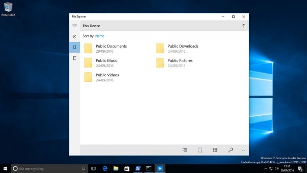
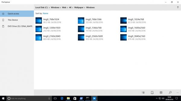
As you may already know from our previous article, Windows 10 build 14936 comes with a new Universal app. It is a modern File Explorer, a UWP app which could replace the classic File Explorer in the near future. Here is how it looks like.
Windows enthusiasts managed to get it working. Here is how it looks like:

 As you can see, as of this writing, the application is basically ported from Windows 10 Mobile. It is a touch oriented app, with no Ribbon or toolbar or any shell extensions. It might be interesting for touch screen users.
At this moment, it is too early to say which features the application will get. We only hope it does not replace File Explorer despite having far less functions and features. The Win32 File Explorer could remain as a deprecated legacy app similar to Internet Explorer. Credits: @tomhounsell, @evil_pro__
Support us
Winaero greatly relies on your support. You can help the site keep bringing you interesting and useful content and software by using these options:

Look ok for cels and tablets, but I use TotalCommander since Win9x
Why Explore if we can Command!!!
Well, I also love to command :D
Using Windows/Total Commander since version 4.0 in Windows 95.
Do you know how to get it working?
See How to launch the Universal File Explorer app in Windows 10.
Probably don’t even need to ask about add-on support as it’s non existent.
Quite possible.
That’s the same app as on Windows 10 Mobile, isn’t it?
As of this writing, it is EXACTLY the same app.
When build 1607 didn’t exist yet, we asked for tabs (Because that would be fukin awesome!), but this is cancer.
I really don’t like this and hope I can still use the current file explorer in the future…
Some things are better of how they are :\
Oh my.. It was expected though. On the positive side at least it doesn’t have 3 redundant links to user folders/devices anymore. Can’t stand it and metro crap myself though; could only hope that in the next few years linux (and, let’s call it the “3rd party” programs) will mature just a bit more.
Not that OS X much better nowadays. I don’t necessarily mind talking holographic spheres, but at the time modern computing looks more like a folder in the cloud with assorted files in it. And indeed it comes with $$ subscription.
Oh dear, it’s OneDrive all over again…
It’s going to take them YEARS before it’s at least half as good as WIn32 one. Network drive support and proper copy, cut, paste via a clipboard, instead of a the inferior CopyTo MoveTo is ESSENTIAL!.
I do not like it ! Its to flat and feature less, at least on desktop Win10..
It fits the appearance of Windows 10. I don’t like how it useless and featureless.
My god that looks ugly. And it looks featureless too. I hate the way MS are using icons for everything and they’re totally unintuitive, a clock a phone and a memory card.. what the hell? If the rest of MS’s universal apps are anything to go by this will be terrible.
Either nobody at MS can program UWP properly or else the whole platform is too limited. Neither of which is good.
Yeah. Maybe it is because the app is ported from Windows 10 Mobile.
They might want to refine it soon.
Yea, I suppose. Even still though, they’re one of the biggest companies in the world and it takes them forever to get anything done. I heard there was a new File Explorer in the works months ago, and this is what they release.. lol!
It looks like something a novice programmer would come up with after an hour or two.