Cinnamon is Linux Mint's flagship desktop environment. Started as a Gnome fork, now it is fully independent, but Gnome's roots can still be found in this DE. One of them is the appearance of menus, which will be changed in the next release.
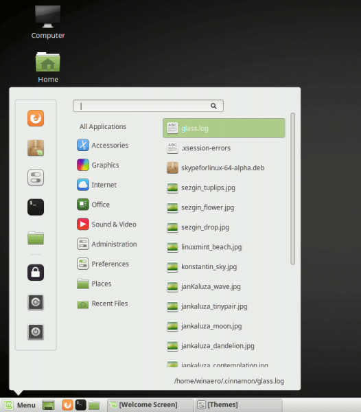
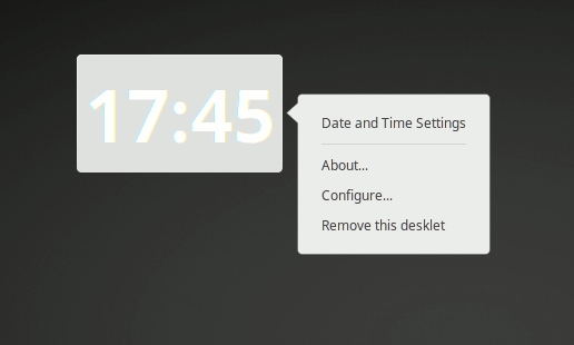
Here is how menus look like in the current version of Cinnamon:

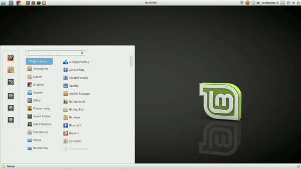
There is a huge gap between menus and their parent button. This makes the apps menu appear with a margin from the menu button. Cinnamon has had such menus since its very first version. Its developers finally decided to change them. In the upcoming version of Cinnamon, menus will have a classic look without additional arrows and margins:
 The menu now opens right next to the panel, applet, desklet, or whatever UI element you open it from. According to Cinnamon's developers, this will simplify the menu drawing code and allow theme creators to use the full range of CSS properties.
Finally, menus have got new animation effects, which are closer to native GTK3 effects. Watch the following video to see them in action:
You can subscribe to our YouTube channel HERE.
That's it. Source: Segfault.
Support us
Winaero greatly relies on your support. You can help the site keep bringing you interesting and useful content and software by using these options:
