The Gnome 3 Linux desktop environment is not something that is extremely popular today. Modern versions of Gnome have nothing common with the traditional desktop paradigm. At one time, Gnome used to be one of the most popular desktop environments. But it has diverged so much from Gnome 2 that it looks different, it works differently, and it is very unique. It does have a number of great features.
Advertisеment
Gnome is not my favorite desktop environment in Linux. But I keep it installed and use it from time to time. I really like some of its features. They are very convenient (if you can call Gnome 3 convenient, of course).
Instant search of everything
Search is a really great feature of Gnome 3. By typing a description of the task you need to perform on the Activities screen, you can find anything you want on the local PC or go directly to the Internet and continue there.
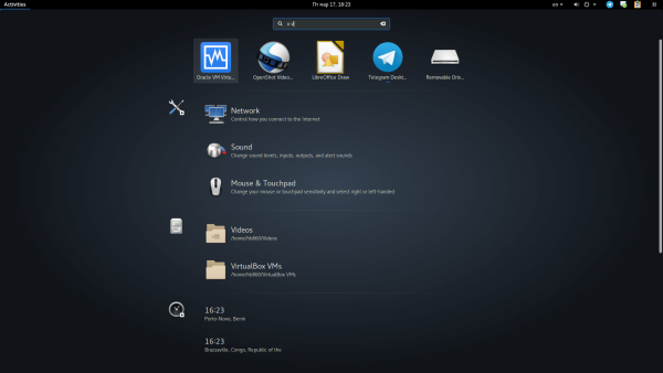
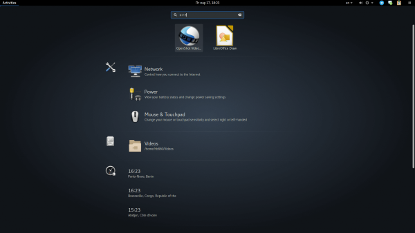
I especially appreciate how search works when you enter just a few letters of the app's name on the Activities screen.
For example, I can type "s m" to open the System Monitor.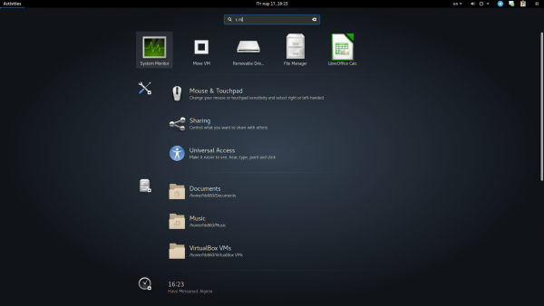
Or o v to open Oracle Virtual Box
 Or o v e to open OpenShot Video Editor.
 I can type "bost" in the search box to see the current time in Boston, USA.
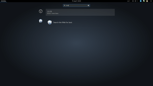
This is just awesome. You can forgive a lot of Gnome 3's design mistakes just because of this feature. This is how the search used to work in Windows 7 and Windows 8.x, but does not work that way in Windows 10 any more, thanks to Cortana which broke it.
Screenshots
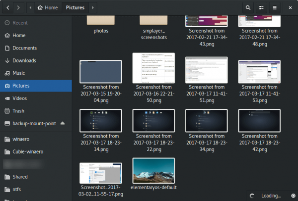
Another great feature is built-in screenshot support. Driven by hotkeys, it allows you to capture the whole screen, an active window or a screen region to the clipboard or directly to a PNG file under $HOME\Pictures\Screenshot-*. If that is not enough, you can record a screencast to a WEBM file! Everything can be done natively without installing additional apps (besides the Gnome suite).
Here is the list of hotkeys:
PrintScr Take a screenshot
Alt+Print Take a screenshot of a window
Shift+Print Take a screenshot of a region
Ctrl+Print Take a screenshot and paste it to the clipboard
Ctrl+Alt+Print Take a screenshot of a window and paste to the clipboard
Ctrl+Shift+Print Take a screenshot of a region and paste to the clipboard
Ctrl+Alt+Shift+R Video capture desktop
Hotkeys for everything else
You can launch any app, find and open any file and open notifications - all with hotkeys. This is really time-saving and useful.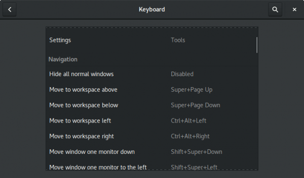
Window management
Personally, I like the default way the Alt+Tab/Win+Tab works in Gnome 3. Windows are grouped by the app in the window switcher dialog. It reduces the size of the list and makes it easy to spot the required app there.
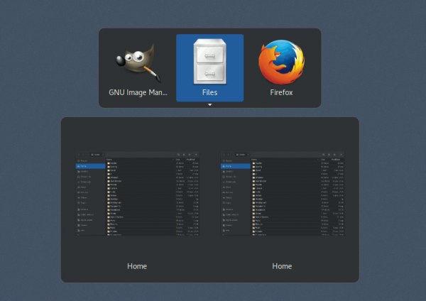
By default, it returns you to the last used instance or window. When in the app, you can quickly cycle between open windows with Alt+` or Win+`. I find this behavior very convenient. I am using several instances of Firefox. This allows me to jump between them in a moment.
Automatic Recycle Bin cleanup
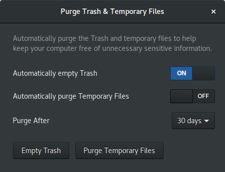
Gnome 3 invented a nice option. It allows you to clean up your Recycle Bin after some time automatically. This is very convenient. It looks like someone at Microsoft was inspired by this feature too and 'copied' it for Windows 10. The automatic Recycle Bin cleanup feature exists in Gnome for a long time.
Built-in apps are stable, reliable and useful
Not everyone would agree here, but I like the apps shipped with Gnome. Most of them are very convenient.
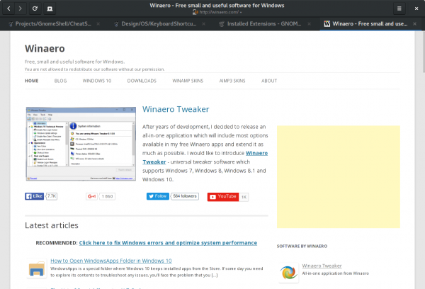
Probably, my favorite app is Epiphany, known as Gnome Web these days. This is a really lightweight browser with a slick UI. It works fast, it starts quickly, has the delayed tab loading feature and ad blocking out-of-the-box.
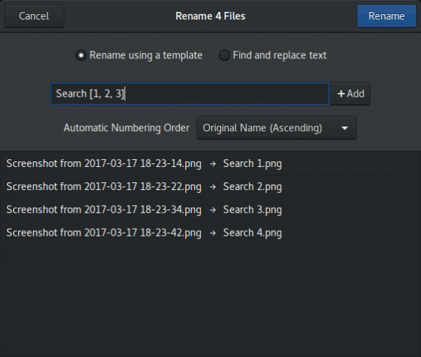
The Nautilus file manager (Gnome files) is also one of my favorite apps. While its developers dropped a lot of features from the app (like secondary file pane view), it covers all my needs for file management tasks. I appreciate its built-in archive support and group file renaming. I use these features a lot.
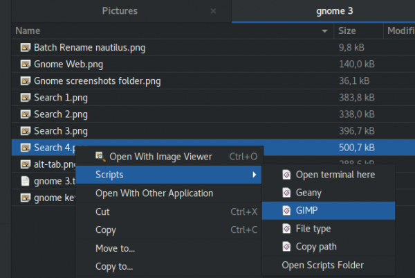
It is extensible with scripts, which are just executable files in the ~/.local/share/nautilus/scripts directory. You can put anything there that you want. This is really useful.
The application is mature and stable. I tried a lot of file managers in Linux, but Gnome's Nautilus is one of my favorite GUI apps.
I like most of the apps which come with Gnome 3, except Empathy, which is buggy and unusable. There is nothing better than the good old Pidgin for my instant messaging needs.
And last but not the least, I like the dark variant of the default 'Adwaita' theme and how all apps use it. It looks decent.
Of course, Gnome 3 is far from perfect. The system tray hidden in the bottom left corner of the screen is something awful. Thankfully it can be fixed with the TopIcons Plus extension which embeds the tray in the top panel.

Another issue is drag and drop. You can't quickly drag files from the file manager to another app if the destination window is not visible on the screen. There is no taskbar button to which you can drag files in order to activate the required app. There is no taskbar at all in Gnome 3.
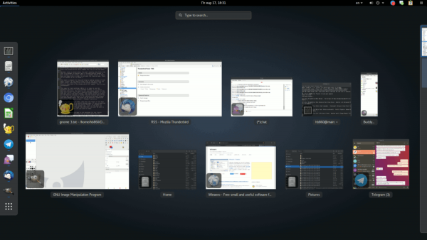
You need to prepare for drag and drop by making the windows of both apps visible. Or you need to drag files to the Activities top left corner, then drag files on the window thumbnail, and finally drag them to the window which appears. This is very inconvenient!
The same is true for task switching. While it is okay to use keyboard shortcuts to switch between windows, it is really a nightmare with the mouse. You need to move your mouse pointer to the top left corner, then find the required window's thumbnail or click the app's icon in the Dash toolbar. The toolbar allows switching to the desired instance or window from the context menu of the running app's icon. But there is no indication of how many windows you have opened there.
The list of installed apps is not designed for the classic Desktop metaphor. It is a fullscreen list of icons which has no categories. It requires a lot of clicks to find an app without typing its name. Also, you need to switch between the frequent apps and the all apps view and then scroll a huge grid of icons. This layout reminds me of Windows 8's Start screen which was just as poorly designed. But it's worse because you can't even pin desired apps for faster access.
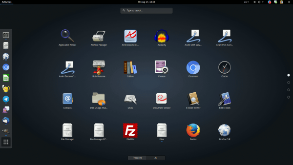
When you open a lot of apps, they mess up the layout of the Dash panel. Since the Dash panel can be used to switch between apps, you might get accustomed to its layout during an active session. But unexpectedly, when you open yet another app, the icons in the Dash panel not only get resized but they change their position, disturbing your workflow. You won't be able to click the icon in the same location as it was earlier.
These issues have made Gnome 3 unpopular. Today, people who used Gnome 2 have moved on to XFCE, MATE and Cinnamon, all of which still offer the classic desktop paradigm. Despite the fact that Gnome 3 apps are stable enough, most users do not like the appearance and behavior of the Gnome Shell and do not wish to learn how to use it.
Well, that's my opinion of the Gnome 3 desktop environment. Have you used it and how do you feel about it?
Support us
Winaero greatly relies on your support. You can help the site keep bringing you interesting and useful content and software by using these options:

For a site that focuses mostly on Windows stuff, this is actually a really good, informative coverage about GNOME 3 (and positive too, since a lot of people talk about the bad bits of it more than the good). I generally try to avoid it when using Linux since it deviates too much from the traditional desktop paradigm that I’m used to and the developers are too stubborn at removing features without a reasonable alternative to take their place. But hey, thanks for the article!
Thanks for the kind words!
I’ve just recently started trying out some Linux distros, because I don’t like the direction that Windows is heading, so here’s just a few of my thoughts on GNOME as a first-time user. I don’t like the way that GNOME splits up everything into the apps menu, the dock, and the top bar. I prefer how Windows does it, with pretty much everything being accessible from the taskbar. A lot of the UI elements also seem a little over-sized to me. It’s especially noticeable in Eclipse, which in my opinion, is pretty much unusable because of how much space the tabs and toolbars take up compared to Windows. I’ve been trying out KDE for the past week, and have had a MUCH better experience than I did with GNOME.
I suggest you to try XFCE4. It is just awesome.
I’ll add it to my list. Thanks for the suggestion.
Actually, XFCE4 is my favorite DE. It is very fast, flexible and almost bug-free
If you won’t happy with Thunar, its default file manager, then replace it with PCManFM or Nemo.