With recent Windows 10 builds, Microsoft is getting constant negative feedback about the icons used in the OS. Many users do not like the bright yellow folders which have a strange shape and no gradients. Microsoft is listening to feedback and trying to rework the icons for Windows 10. The unreleased internal build, Windows 10 build 10125 comes with new icons and a few minor UI changes.
Advertisеment
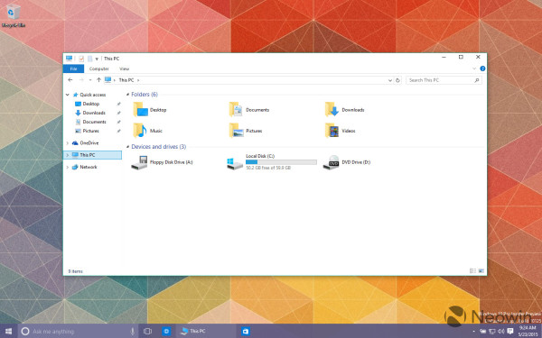
In Windows 10 build 10125, the File Explorer icon, drive icons, This PC, Network and folder icons got updated. Now they look like this:
![]() These icons now have a more traditional look compared to the previous icon set.
These icons now have a more traditional look compared to the previous icon set.
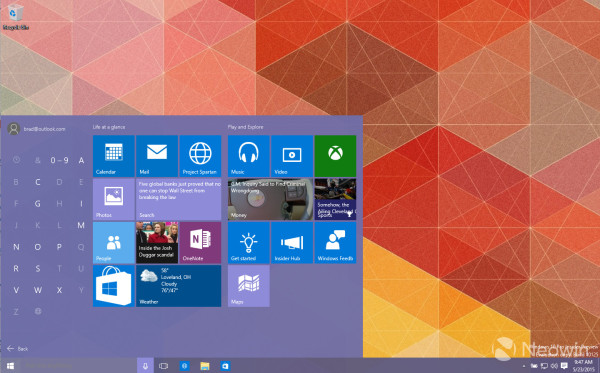
![]() The main UI change is in the Start menu. When you click on the 'All Apps' section, it will show you a letter grid instead of the former implementation of a list of apps grouped by letter which you had to vertically scroll.
The main UI change is in the Start menu. When you click on the 'All Apps' section, it will show you a letter grid instead of the former implementation of a list of apps grouped by letter which you had to vertically scroll.
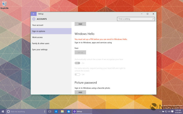
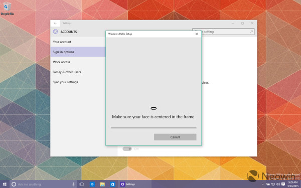
 This build also finally features the new authentification method for logging in based on face recognition. It is known as Windows Hello:
Neowin reports other UI changes too including more polished-looking Jump Lists and the Date and Time widget:
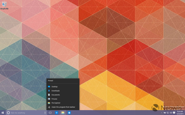
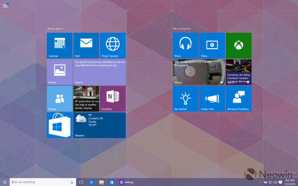
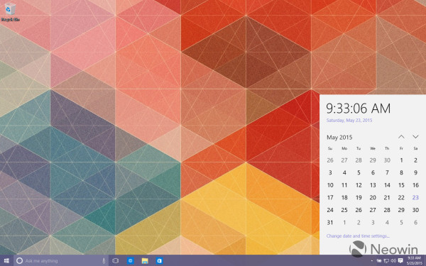 Additionally, in Tablet mode, the hamburger button will show when you have a new app installed:
 Well, while these changes are not major, but many users may finally like the new icons. Personally, I am glad to see the new icons but the Start menu changes don't look that useful to me. While the letter grid minimizes app list scrolling, it is more suitable for touch screen devices. Just like search, the grid forces the user to know the beginning letter of that app that he wants to launch and then tap it or click it. Nevertheless, it is an interesting way to minimize vertically scrolling a long list of apps. What do you think about these changes in Windows 10? Let us know in the comments (via).
Support us
Winaero greatly relies on your support. You can help the site keep bringing you interesting and useful content and software by using these options:
