Classic Shell as almost everyone using Windows knows is the gold standard of Start menus. It firmly entrenched itself at the top place by bundling an amazing level of customization and features. Although Microsoft returned the Start Menu in Windows 10, they have been generally taking out functionality, simplifying things instead of keeping them powerful. Let's see today why a free app like Classic Shell is still worth using in Windows 10, Windows 8.1 or even Windows 7.
Advertisеment
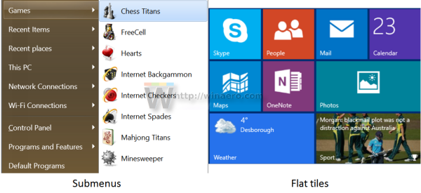
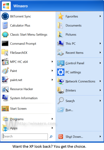
Classic Shell's Start Menu gives you easy access to more stuff on your computer by organizing it into submenus. By comparison, the Windows 10 menu's right side is flat and requires you to pin anything first to access it. Even though you can organize pinned items into groups, as you fill it with more tiles, it looks cluttered and harder to locate. The submenus of the Classic Start Menu on the other hand give you access to a vast amount of data on your PC organized by the appropriate category. Your documents, pictures, music, downloads folders, as well as your recent documents, drives, connections, Control Panel settings, apps and anything you want to add there is just one tap or one mouse click away. As we covered when version 4.2.5 was released, you can combine folders into one submenu too or directly add a Library as a submenu.
You don't have to pin everything
In the Windows 10 Start menu, pinning is required to quickly open anything if you don't want to use search. You must take the time to pin and organize tiles. Classic Start Menu's organization on the other hand means if your folders are organized when the app is installed or the document is saved, then you don't have to spend further time organizing anything.
Better, flexible presentation of All Apps (All Programs)
 The All Apps section of the Windows 10 Start menu remained more or less the same as Windows 7. Microsoft only added letters which you can tap to jump that that part of the list. But in Classic Shell, you get the choice of whether you want to display All Programs like Windows 7 or like multiple columns of Windows XP so you don't have to scroll up and down in a limited area to locate the program. Plus, if the menus closing when you hover and having to start over bothers you, you can just increase the Menu Delay setting so they open and close only by a mouse click.
Search is faster and more customizable
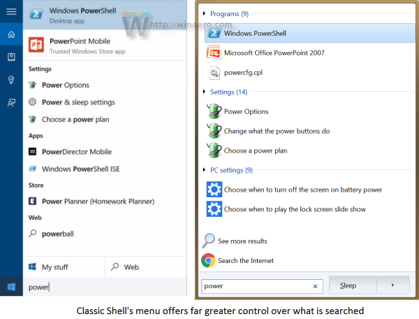
The search in Classic Start Menu is more customizable. You can choose what exactly it will search. Plus it searches your programs and Control Panel settings even if Windows Search indexing is turned off. It also searches the modern Settings app and your files and shows them like Windows 7 did, logically grouped by category. You can also filter folders from the search box by typing, for example, C:\Documents\*.doc. Windows 10 search on the other hand focuses more on searching the web and the Store. Although it does search your programs, settings and files, it often misses out on some items, doesn't find them at all or shows the wrong top result. Also, you have to click on the "My Stuff" button to really explore file search results. Classic Start Menu's search on the other hand is very powerful. You can read a detailed guide HERE of how it works.
Keyboard accelerators
In Classic Start Menu, you can press jump to any item by typing its first letter. This is especially useful in All Programs list which is sorted by name. You can also sort the main menu's pinned and frequent/recent lists by name and press the starting letter of the program to locate it and press Enter. Or you can show All Programs automatically when you click Start button and directly press a first letter to jump to it right away. The Windows 10 menu on the other hand does not support such navigation via the keyboard.
Cleanly separated programs vs apps
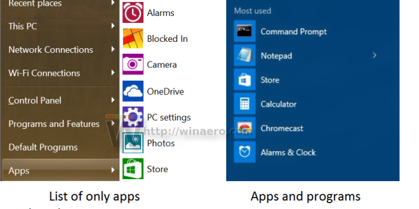
Classic Start Menu cleanly separates programs from apps. As you know, programs are the powerful, Win32 applications which have an installer and are designed for mouse and keyboard, but they can also be extended to work with touch. Apps on the other hand are generally simpler, touch-first but also work with mouse and keyboard. They can be installed from the Store and are auto-updated. Since there are vast differences between the two, it makes sense to separate them cleanly. The Windows 10 menu unfortunately lumps them together in one big list. Microsoft has also started replacing many powerful programs in Windows with simplified apps, leading to some dissatisfaction amongst users.
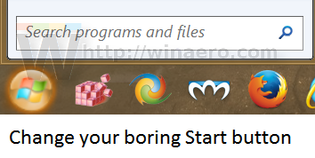
Classic Start Menu lets you pick your own Start button image. You can choose from their vast collection of downloadable Start buttons and apply any of them as your current button. The size of the button can also be adjusted along with several other parameters. It also supports animated Start buttons! Windows 10 menu offers no such customization.
Change the icon size and DPI to make it as small or as large as you want
Depending on your resolution and usage (mouse vs touch), you can change the size of icons anywhere in Classic Start Menu. It has two settings: small icon size and large icon size which you can modify to change them throughout the menu. You can also change the DPI setting to make it bigger or smaller irrespective of the system DPI setting. The right side of the Windows 10 menu does have large, medium, wide tile sizes but the rest of the menu does not let you really make the icon size larger or smaller.
Skins
Classic Start Menu supports skins which means you can completely change the look of the menu by installing more skins if you get bored of the same look. The Windows 10 menu can't be made to look much different with its Tiles and flat colors.
Multi-monitor awareness
The Classic Shell Start Menu is smart enough to understand when you move your mouse pointer to another display. When you use the Windows key, it will open automatically on the monitor where the mouse pointer is. What's impressive is if you use the Shift+Windows key, it will also make the Windows 10 Start menu open automatically on the correct display!
Open several items by holding down Shift
In Classic Start Menu, you can hold down the Shift key to keep it open and launch as many items as you want before finally letting go of the Shift key. Whether you use search or browse to the submenus, you can use this trick to boost your productivity. The Windows 10 menu closes every time you open anything. You must open it again to launch another item.
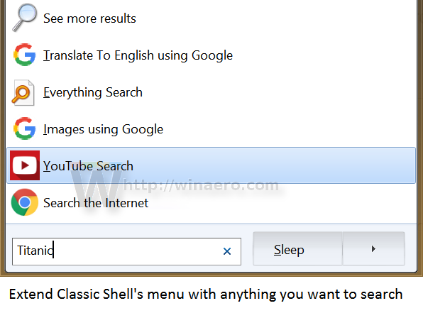
Search Providers
Classic Shell's menu has search providers which we covered in detail when version 4.2.5 was released. They let you pass on the search term that you type to other programs or to internet websites. You can create search providers for Google, Bing, Google Translate, Google Image Search, Wikipedia, YouTube, or your favorite desktop search tool like Everything. The Windows 10 menu has no search providers but does have Bing search integrated. But when you actually click a web search result, it eventually opens your web browser so there's not much difference between as long as what you type is passed on the correct service or app.
Better keyboard operation
You can assign a custom hotkey to open the Classic Start Menu or you can make middle click or Shift+Win key open the menu of your choice. You can open the properties for something by pressing Alt+Enter, like Explorer. The customization it offers far exceeds the Windows 10 menu.
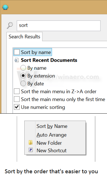
Sorting
You can sort your programs list, most used app list and your pinned list by name in Classic Shell. You can also sort your recent documents by name, by extension or by date. If you like having a particular program at the particular position, you can drag it up or down to sort it. The Windows 10 menu does allow free sorting but there's no quick Sort by name function for items pinned to the right side.
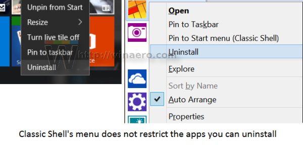
Uninstalling Metro apps
The Windows 10 Start menu prevents you from uninstalling certain pre-loaded and built-in apps. Classic Start Menu lets you uninstall any app except system apps like Settings, Edge, Cortana and a few others.
The Windows 10 menu is not without its benefits - it does have some improvements which we covered earlier. In the end, it's a matter of preference since Microsoft couldn't build it all into one menu.
Tell us in the comments which Start menu you prefer and why.
Support us
Winaero greatly relies on your support. You can help the site keep bringing you interesting and useful content and software by using these options:

Classic Shell Start Menu is for people who can’t use Windows 10. IMHO the 10 start menu is much easier than anything out there.
Which one is better for a relatively unsophisticated user that doesn’t do work on the computor.
It is not for power users or I.T. like me. It is a pain in the ass to use as the search is bloated with inexact results and shortcuts, which we were used to work with no longer exists in the new one,.
Classic Shell looks terrible on these pictures. Classic Shell Start Menu is for blind or tasteless people only. Otherwise, Windows 10 Start menu is beautiful and useful.
Let me tell you that Classic Shell supports skins and can be customized the way you want. Compared with Classic Shell, Windows 10 start menu is very limited.
I doubt that you even read this article.
I would never use the default Windows 10 start menu, for me it’s an abomination – slow and stuffed on the left with ridiculous functionality on the right (huge squares, really?). For a free program, I think Classic Shell is more than anyone can ask for, it’s well supported and packed with great features, including skin support. Personally I prefer StartIsBack (a little better IMO), but it’s not free, so I use Classic Shell in my VMs instead.
Except for Tiles, the default Metro skin has the same look as the Windows 10 menu so if you are trashing its look, you are trashing the Windows 10 menu too.
Let me show you sth. I use both menus but CS is the main one. It’s how it looks.
http://wrzuc.se/i/598b91ad8c126
Your view and reply is what’s “tasteless”, it sounds as something that came from Dictator Drump!
The Start Menu X still better than Classic shell
Spam much? Obviously as its developer you would think so but you don’t have it rub it in everyone else’s faces.
I think there’s no comparison. Classic Shell wins hands down for sheer number of customizations plus it’s super fast. Without it we would just be sucking up to whatever crap Microsoft shoves down your throats and calls as an improvement.
Yup! You are correct!
Of course you’re absolutely right, as usual. I’ve put this on all of my customers’ Windows machines since 2010, at first just for the fly-out programs list because the keyhole type list in Vista and 7 is a nightmare of scrolling and clicking. All the customization is a great bonus but of course with the unmitigated disaster of the Metro interface, Classic Shell became a necessity and turned that frightful mess into something quite usable.
As a one time graphic designer, I agree that Win 10’s Start is very pretty but that’s not enough of a virtue in a tool to be used for getting real work done. Decluttering by separating apps makes sense too, although I’ve always just blown them all out in one shot from a terminal. It always felt rather good. ;)
It’s like the Emperor’s New Clothes watching Microsoft removing real features, conveniences and usability from Windows while advertising how it’s better than ever. Why anyone would take the time to come here and offer such crude defense of this direction is hard to understand.
Sometimes, the Start Menu of windows 10 disappear, and at this time the Windows should be recovered. It is a headache.
In addition, the Start Menu of windows 10 does not work, or does not response when I have clicked start button. In this case, the computer should be re-booted in order for the start menu to work properly.
I prefer Start10. If you dont open the settings menu, it looks more native than the Windows 10 startmenu itself
Start10 is buggy and crashes my Explorer sometimes. Also it is an incomplete recreation of the Windows 7 menu. The search in Start10 doesn’t look for Control Panel keywords, it only searches Control Panel settings descriptions. Type ‘UAC’ and you get nothing. Or type ‘hibernate’ and you get nothing again. You miss out on the whole keyword database that MS added for Control Panel. Also, Start10 doesn’t let you rearrange (sort) items by drag and drop inside All Programs. Classic Shell does all of the above, plus more and is very stable, free and extremely fast. Classic Shell is also updated for modern Windows 10 features like touch keyboard, high DPI, uninstalling apps etc.
YES I cannot drop or move my pictures or documents or anything in Windows 10, a feature that is a must have foe most ppl these days, they went backwards by removing our right ot move, drop our own stuff in a folder or to another folder or page..terrible, Classic is way better in that regard on top of all the other features I loved in XP and Vista..even 7 which I did not like was not as bad as Win 10
Given that I do not use any of the “Apps” is there any way I can remove the Apps item entirely from the Start Menu pulldown menu. It is just clutter and if for some incomprehensible reason I need to access it I can shift-click Start to get the MicroSad Start thing up. (Generally that only happens when the cat is standing on the keyboard.)
See Hide App List in Start Menu in Windows 10. I hope I got you right.
Thanks. Currently, I don’t have that setting available basically because I am still running 14393 – my system is set to defer functional upgrades for several months so that other people can find the bugs. I’ll give it a try when the upgrade arrives and I’ll post here for reference when I know the outcome.