In Windows 10, Microsoft has reinvented their Start Menu again and as everyone knows, it is not the usual Start Menu from Windows 7 but instead one which only somewhat retains the functionality of the original menu while adding some different features. While personally, I prefer the Classic Shell Start Menu which offers the ultimate productivity and usability, there are some interesting improvements made to the Windows 10 menu which I observed. Let's see what they are.
Advertisеment
Live Tiles with Push notifications
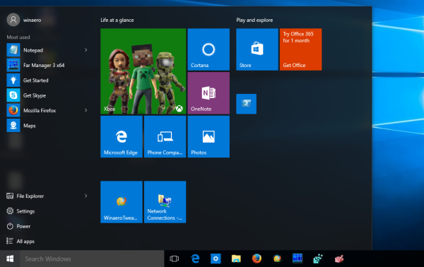
This is no secret. Windows 10 menu has Live Tiles which are touch-friendly but did you know that they are powered by push notifications? Meaning that the app does not have to be running constantly in the background to receive updates. Using push Notifications, a tile can receive updates even when the app is not running.
More space for pinning your apps
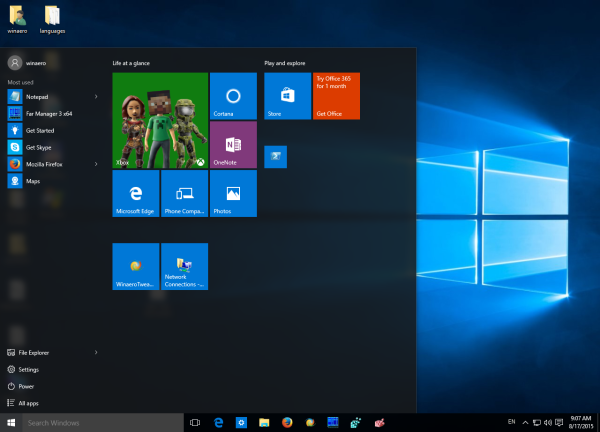 The Windows 7 menu had a limited amount of space for pinning your programs because it expanded vertically. The Windows 10 menu can expand horizontally so there is plenty of space available to pin the apps that you need.
Organizing pinned items into groups
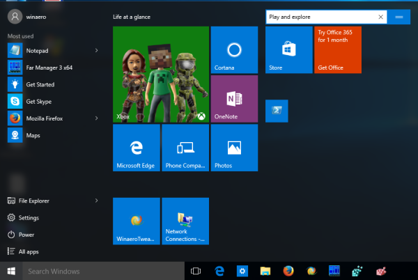
In the Windows 10 menu, you can organize pinned items into groups of your choice. For example, games can have their own group. Desktop apps can have one group, Store apps can have another. This makes it more organized instead of one big list.
Recently installed app
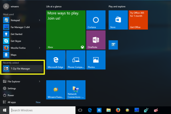
The Windows 10 menu shows you the app that you recently installed so you don't have to go hunting for it inside All Apps. This ability did exist in the Windows 7 Start Menu too but Windows 10 clearly labels these sections of the menu as "Most used" and "Recently installed" making them easier to understand for you
Uninstall apps by right click
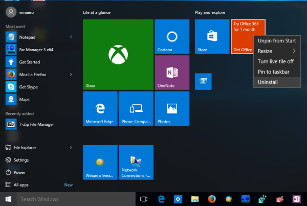
You can remove any app that you downloaded from the Store by right clicking it inside the Start Menu. Not all built-in apps can be uninstalled but for those, we have the PowerShell method.
Alphabetically sorted app list with clickable and tappable letters
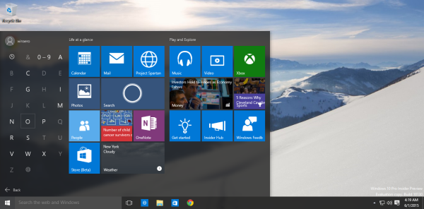
This feature of the Windows 10 menu comes straight from Windows Phone. Inside All Apps, you now have the ability to click or tap the letters to avoid scrolling up and down. Also, the app list is sorted just once, so folders are no longer grouped separately at the top, followed by single app shortcuts.
Improved search
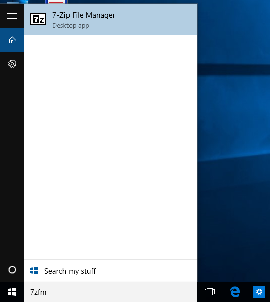
The Windows 10 Start Menu can search EXE names of program shortcuts and can do approximate string matching . For example, you can type reshacker instead of typing 'Resource Hacker' and it will still find it. Or you can type uTorrent instead of μTorrent. It is also tolerant of a few typos that you make.
That's it. What do you think about the Windows 10 Start menu? Do you like it?
Support us
Winaero greatly relies on your support. You can help the site keep bringing you interesting and useful content and software by using these options:

It should be noted that Classic Shell can enable a search just like the Windows 10 one, including searching the internet.
I love this Start Menu. It is simply the best that MS has made. I especially enjoy the live tiles, and the tappable letters. That and the search make finding programs a breeze! No wonder Microsoft won a major design award for the Start Menu. It is simply THAT good!
Hahaha that award was rigged or the idiots who present that award know nothing about balancing utility value with design. The Start Menu is a joke.
That is your opinion, but the start menu is actually quite usable, and informative. The Windows 10 start menu is the FIRST one that I have actually been able to use other than the Windows 8 start screen. Before Windows 8 I made toolbars with my apps in them as I found the start menu too cumbersome.
You are wasting your time with Classic Shell. Start Menu X isn’t as pretty but you won’t believe how customizable it is. It is amazing. There are free and paid versions.
http://www.startmenux.com/index.html
That Start Menu X sucks.
It is a joke compared with Classic Shell.
I really gave Start Menu X a try but its usability is broken. It has some nice ideas but it behaves very unexpectedly. Win key doesn’t reliably open and close it. The arrow key navigation is broken. Search and accelerators are sluggish. The hot corner is broken when pressing the Start button. The developer Dennis Nazarenko needs to be pay attention to such small details. I even saw him spam and rant at Classic Shell’s Facebook page because he was pissed that his menu isn’t as popular.